LA Crime Tracker: Dashboard Insights 2020 to Present
Situation:
The project focused on analyzing crime data for Los Angeles using Tableau to uncover trends and insights that could help in crime prevention. The data included information on victim demographics, crime locations, and weapon types.
Task:
The goal was to create an interactive dashboard that clearly visualizes the important data. This involved designing several charts and maps, making sure everything was easy to understand and explore.
Action:
The initial data was relatively clean, so only simple preprocessing was needed. This included minor adjustments like handling missing values, standardizing formats, and ensuring consistency across the dataset.
Developed a comprehensive dashboard in Tableau with these key components:
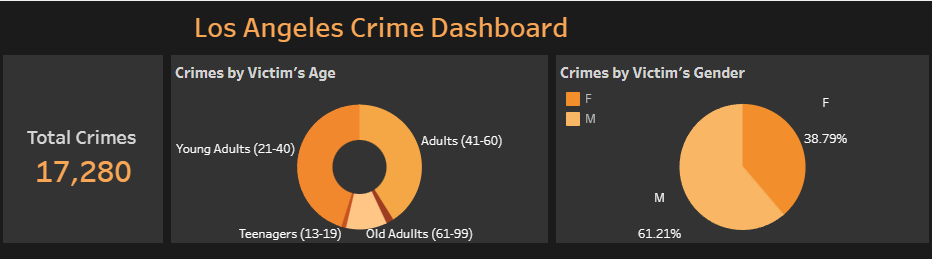
Total Crime Data KPI- This provides a quick snapshot of the overall crime numbers in Los Angeles
Donut Chart for Crimes by Victims' Age Group- The bar chart includes a drill-through feature that enables users to navigate through different levels of detail. Whether examining sales figures by year, publisher, platform, or genre, users can easily explore the data and uncover meaningful insights.
Pie Chart for Crimes by Victims' Gender- Chart highlights the percentage of crimes affecting men and women, giving a clear comparison
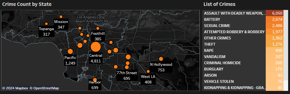
World Map with Crime Count by State- Map displays where crimes are happening across different states, with a focus on Los Angeles
List of Crime Categories- This lists the number of crimes in each category, helping to identify which types of crimes are most common
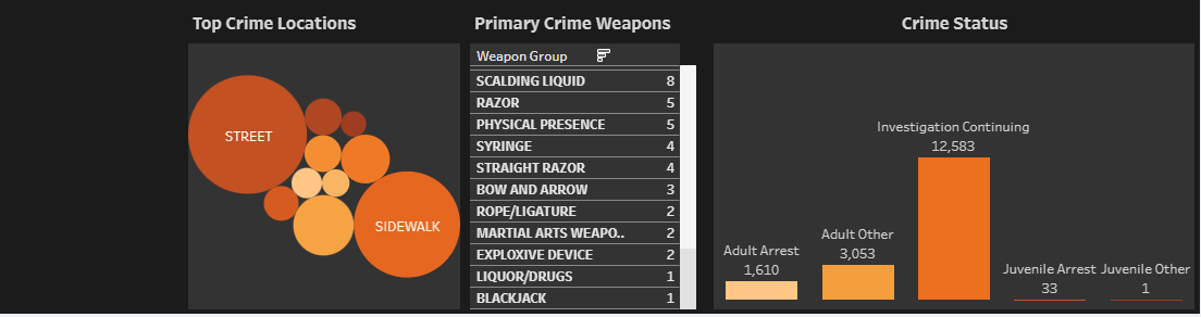
Bubble Chart for Top Crime Locations- Pinpoints the locations where the most crimes occur, with bigger bubbles for higher crime rates
Bar Chart for Crime Count by Primary Weapons- shows the most commonly used weapons in crimes, emphasizing the prevalence of guns
Bar Chart for Crime Status- Interactive chart allows users to see the status of crimes (e.g., open, solved) and how they compare across different categories
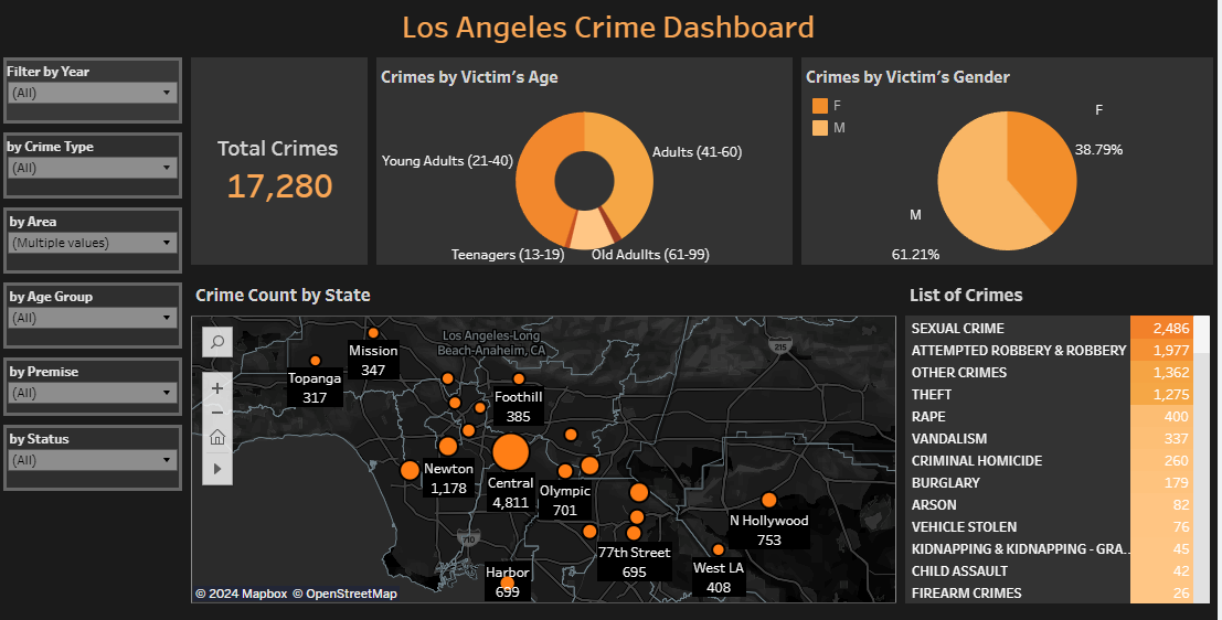
Easy Filtering Options-Filters for year, premise, gender, crime type, area, and crime status make it simple to explore specific aspects of the data
Results:
- Approximately 25% of crimes were found to occur in Central Los Angeles, particularly on sidewalks and streets, marking these areas as critical zones for crime prevention
- Analysis revealed that guns are the most commonly used weapons in over 1,000 crimes, emphasizing the need for targeted interventions
- Central Los Angeles was identified as having a unique issue with crimes in multi-unit dwellings, suggesting a need for focused security measures in these residential areas
- Men were found to be the most affected across all age groups, while women were predominantly victims in sexual crimes, with a crime count of 1,832 (74.02%)
Skills developed during the process:
This project led to significant growth in several areas:
Interactive Connections in Tableau- This project needed fine interations between charts. Developed and improved skills in creating interactive connections between different charts and filters. This allowed the dashboard to be more dynamic, where selecting an option in one chart automatically updates the others, enabling deeper exploration of the data
Dashboard Design- The data is entirely about crime. Designing a dashboard which allign with the vibe of the data is important. The project helped me dive deep into this perspective
Geographical Chart Maps- Gained advanced skills in using geographical maps to represent data spatially. This involved not just plotting data on a map but also ensuring that the map was interactive
Data Visualization Best Practices- Improved understanding of how to effectively present data so that it is easily interpretable by users with varying levels of expertise. Ensuring that charts are not cluttered, and using labels and legends effectively. The goal was to make the data accessible and the insights immediately clear, reducing the cognitive load on users.
User Experience (UX) Considerations- Focused on enhancing the overall user experience by ensuring the dashboard was responsive and user-friendly. This included implementing easy-to-use filters and ensuring that the dashboard performs efficiently even with large datasets.